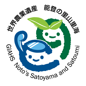
Noto Regional GIAHS Executive Committee has decided to adopt a logo that represents the image of the integrated strength of Noto's Satoyama and Satoumi areas in order to increase awareness of its importance as a global agricultural heritage and to foster a movement to "Create an effective Satoyama and Satoumi".
To use the logo, an application must be sent to the Noto Regional GIAHS Executive Committee.
GIAHS Noto's Satoyama and Satoumi Logo

The word "Noto" is incorporated in the "green NO", Japanese for Satoyama, and the "blue TO." The design portrays Noto's traditional livelihood from agriculture, forestry and fisheries, and the vigor and lively spirit of the people devoted to the conservation of Noto Peninsula.
Selection Process
The information about the logo contest was spread through the mass media, Ishikawa Prefecture's website, technical magazines and websites from 7 October to 4 November 2011. Of the 445 entries from 275 people, one winning logo and three honorable mentions were selected in December 2011 by the review committee established by the Noto Regional GIAHS Executive Committee.
83 entries from 48 entrants from Ishikawa
362 entries from 227 entrants from 40 different areas outside of Ishikawa
| Winning entry |
Keiichi Kusano (Designer, Nagasaki) |
Honorable mentions |
Masaki Koshiba (Designer, Hyogo)
Shin-ichi Maruyama (Designer, Nagano)
Shigekazu Fukagawa (Designer, Osaka)
|
Contact Us
Noto Regional GIAHS Executive Committee
c/o Satoyama Creation Office, Environment Department, Ishikawa Prefectural Government
1-1 Kuratsuki, Kanazawa, Ishikawa, 920-8580 Japan


